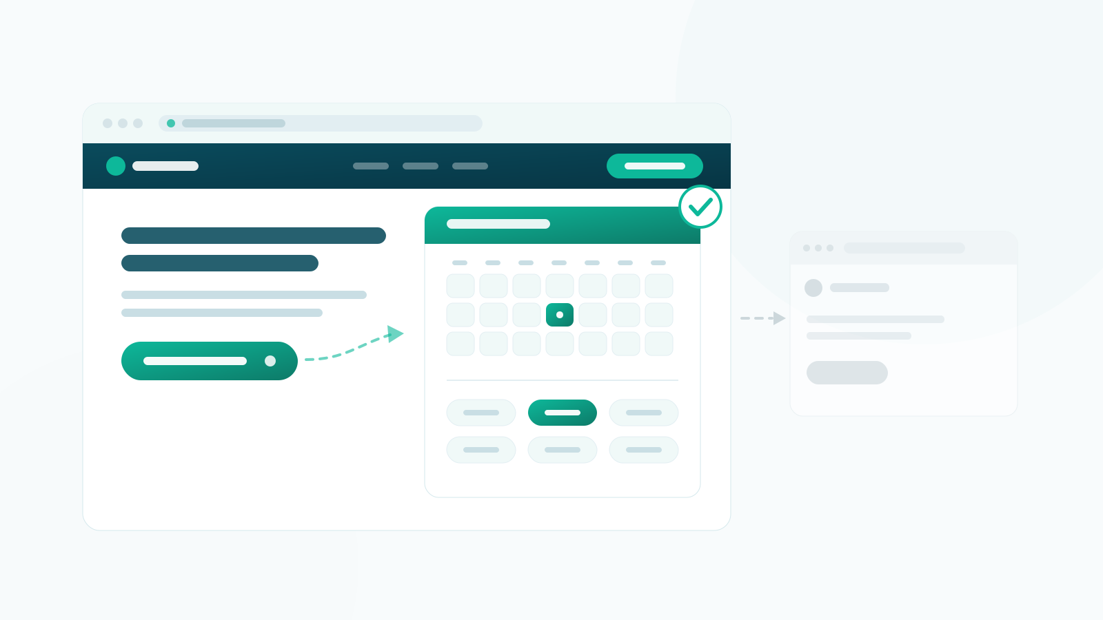
If you have ever sat looking at your own clinic site wondering how do patients actually make an appointment on my website, you are asking the right question at the right time. You have already decided that people should be able to book themselves in. What nobody tells you is what that actually involves once you get past choosing software.
It is less about the booking tool than you would think. Most of what determines whether patients book online comes down to unglamorous decisions: where the button sits, what it says, what the page around it explains, and what lands in someone’s inbox thirty seconds later. Get those wrong and the best scheduling software in the world sits there unused.
Here is the practical version, in the order you will need it. (Still deciding whether self-service booking suits your practice at all? Start with Should my clinic have online booking? instead — this guide assumes you have answered that.)
“How do patients make an appointment on my website?”
There are three genuine ways to do this, and the marketing around all of them tends to skip the trade-off. Here it is plainly.
1. Link out to a scheduling service. You sign up somewhere, get a link, and point a button at it. This is by far the fastest to set up — you could do it this afternoon — and for a solo practitioner testing the idea it is a perfectly reasonable start.
The cost is that the patient leaves your website mid-decision. They land on a page in someone else’s colours, on someone else’s domain, and a proportion of them hesitate. Older patients in particular read an unfamiliar domain as “this isn’t the clinic any more” and stop. You also cannot see what happened after they left, so when bookings are lower than you expected you have no way of finding out why.
2. Embed it in a frame on your own page. The same service, dropped into your page in an iframe. The web address stays yours, which solves half the problem, and it is still quick.
The other half remains. Embedded schedulers are usually a fixed height, so on a phone you get a small scrolling window inside a scrolling page — one of the more reliable ways to lose someone. Your fonts and colours stop at the edge of the box. And your analytics see a visit to the page but nothing that happens inside the frame, so “did anyone actually book?” stays unanswerable.
3. Run booking on your own site. The booking form is genuinely part of your website: your pages, your styling, your domain, your database. On WordPress this means a booking plugin rather than an external service.
This takes the longest to set up — an evening rather than an hour, because you have to enter your services, your practitioners and your opening hours before anything works. In exchange the experience is continuous for the patient, you can style it to match, and the patient records sit on hosting you control rather than a third party’s, which makes the data-protection questions much simpler to answer.
None of these is wrong. A single-handed practice with twelve appointments a week does not need option three. A six-practitioner clinic taking bookings all day will outgrow option one within a month. Pick for the practice you are now, and know that moving from one to the next is normal.
Where the booking button actually goes
This is where most clinics quietly lose. The booking page gets built, one link gets added to the main menu, and everyone assumes the job is done. It is not: a patient reading about shoulder pain on your services page should not have to go looking.
Put the button in all of these:
- The main navigation, styled as a button rather than another text link, so it does not disappear among “About” and “Fees”.
- The top of the home page, visible without scrolling.
- The end of every single service page. Someone who has just read your description of a treatment is as ready as they will ever be. Making them navigate away at that moment is a genuine cost.
- The footer, for people who scroll to the bottom looking for the phone number.
- Your Google Business Profile. There is an appointment link field. A large share of people never reach your home page at all — they find you in the map results and decide from there.
One button on the contact page is not an online booking system. It is a booking system nobody can find.
What the button should say
A small thing that measurably is not. The words on the button set the expectation for what happens next, and vague words make people hesitate.
“Book an appointment” works because it names the action and implies it completes. “Contact us”, “Enquire” and “Get in touch” all promise a conversation, not a time slot — so people who wanted to book in ninety seconds brace themselves for a phone call and put it off. “Appointments” on its own is a signpost, not an invitation; it could just as easily lead to a page about your cancellation policy.
If you take both bookings and enquiries, say so with two buttons rather than one ambiguous one. Book an appointment and, quieter beside it, Not sure? Ask us first. Patients sort themselves surprisingly well when you let them.
What belongs on the booking page
A booking form on a blank page converts worse than the same form with a few lines of context around it. People about to give you their name, their phone number and forty-five minutes of their week want a couple of questions answered first.
Above the form, briefly:
- What they are booking and roughly how long it takes.
- What it costs. If the price depends on the case, say what it depends on. Silence reads as expensive.
- What to bring or expect — referral letter, insurance details, wear something you can move in.
- Your cancellation terms, in one sentence. Stating the notice period here is far more effective than hiding it in terms nobody opens, and it is the moment the patient is actually paying attention.
And below the form, a phone number. Some patients will never use an online form, and there is nothing to be gained from making those people work for it.
What has to happen after they click Book
The most commonly skipped part of the whole exercise, and the one patients judge you on.
The moment someone books, two things need to happen. A clear confirmation on the screen — not a grey “submitted” message, an actual you are booked, Thursday the 14th at 2:30pm with Sarah — and an email that arrives while they are still looking at the page. If the confirmation is slow or ambiguous, a meaningful number of people will book a second time to be safe, and you will spend the morning untangling duplicates.
That email needs the date, the time, the practitioner’s name and the full address of the site they should turn up to — which matters more than it sounds if you have more than one location. Add a calendar link so it lands in their phone rather than their memory.
Then, before the appointment, a reminder. And in that reminder, an obvious way to cancel or move it. Clinics resist this, reasoning that making cancellation easy will produce more cancellations. It produces more early cancellations, which is an entirely different thing: a slot released two days out can be re-filled, and a patient who has to phone during working hours to cancel will very often just not turn up instead. You are not choosing between attendance and cancellation. You are choosing between a cancellation and a no-show.
Assume it happens on a phone, in the evening
Test your booking flow on an actual phone before you launch it, not on a narrow browser window on your desk. The two are not the same, and the difference is where bookings go to die.
Check that the date picker can be operated with a thumb, that the time slots are big enough to tap without zooming, that the keyboard does not cover the field you are typing into, and that the whole thing can be completed one-handed on a sofa at half past nine at night. That is when a good share of these bookings are made — people deal with their health after the day is finished, which is much of the point of offering online booking in the first place.
One more thing to check: whether your form makes people create an account before it will show them any availability. Nothing loses a first-time patient faster than a sign-up wall in front of the information they came for.
Five ways this goes wrong
- The “booking” page is really a contact form. The single most common version of this mistake. A form that promises somebody will be in touch has not booked anything — it has created an admin task and left the patient with nothing in their diary.
- Published availability you do not honour. If you have to ring people back to move the slot they chose, you have added work rather than removing it, and you have taught them not to trust the page. Start with fewer bookable services and conservative hours; widen once it holds.
- An off-site portal that looks like a different business. If the page a patient lands on carries someone else’s branding and domain, expect some of them to stop there.
- No confirmation, or a confusing one. Produces duplicate bookings, anxious phone calls, and people who turn up on the wrong day.
- Nobody can find the button. Open your own site on your phone and count how many taps it takes to reach the booking page from a service page. If the answer is more than one, fix that before you change anything else.
The smallest version worth launching
You do not need all of this before you start. You need four things:
- One page where a patient can pick a real slot and have it confirmed.
- A button to it in your navigation and at the end of every service page.
- A confirmation email that arrives immediately and says where and when.
- A reminder before the day, with a way out that does not involve the phone.
Everything else — deposits, waiting lists, online payment, recurring courses — is refinement you can add once you know patients are using it. Launch the four, watch it for a fortnight, and let what you learn decide the rest.
If you run your site on WordPress and option three is where you are heading, Alnora is one way to do it — the booking form runs on your own pages, and there is a free version if you would rather try the idea before committing to anything.